Saturday, 25 October 2008

Artwork Mondays: a painting's "aura"

Today, I'd like to touch on how the artist feels about their own work, and its "aura", and how that differs for the Fine Artist versus the Illustrator. And no, I haven't lost my skeptical, rational mind.

The idea of a painting's aura is one I remember being presented without judgment by the prof in university. The concept has stayed with me.

It's the notion that original paintings have an "aura" that emanates off the paint & canvas surface. Almost as though the original painting has a soul, or a living presence you sense when looking at it. It adds to their specialness. You have not truly experienced the painting until you've seen it in person. Our teachers tried to impart that this is mainly a macho, modernist idea.

In Fine Art, the modernist period was something fairly specific. To sum it up all too briefly, modernism in painting was "paintings with the subject matter of paint". You weren't painting a still-life of an apple: you were painting red paint. As an example, think of something by Rothko, or Pollock. Giant humongous canvases, covered usually in a couple of dominating colours. There was a lot of baggage that went along with this type of work, including that they should not ideally be viewed as reproductions.

Post-modernism in the fine art world, was (again, gross oversimplification) about deconstructing those modernist ideals of pure paint and pure sculpture, and of overthrowing the unique. A post-modern piece of art could contain both a painting and sculpture adjacent as one piece. Take that, modernist!

To look at one example, modernist Charles Demuth created the painting Figure Five in Gold, (1928). Classic Modernism, interplay of colour over a familiar, somewhat random symbol (5) we all know. It's distinct, and certainly was in '28.

Post-modern painter Robert Indiana created this painting,The Figure Five, (1963) as a way of overthrowing the originality of Demuth's Five. He disrupted the original by Demuth's claim to importance by making it one of many instead of unique. I see it as kind of a fine art world version of "screw you".


So paintings may have an aura you can only feel in the presence of the actual artwork, not a reproduction? Not likely. This smacks of vague New Age-y feelings-as-fact. I wondered about this idea for a long time. An exhibit, entitled 7 Florentine Heads came to the Art Gallery of Ontario, and I remember there was to be a Da Vinci drawing included. When I saw it, I anticipated the moment. I frickin' love Da Vinci, and his interest in science as well as his sfumato technique. I looked at each drawing in turn. Looked at one, read the placard, and saw it was his. I got an involuntary shiver down my back. Was it the aura?

Even back then in my proto-skeptical days, I knew there wasn't. I only felt it's "specialness" after reading who it was by. Looking only at the drawing, I saw another example of excellent work by a Renaissance artist. Context mattered to the aura, it seemed.
Which brings me to addressing the photos of posters peppered throughout this post. Is one of the differences between an illustrator and a fine artist -at least, a modernist one- how they feel about a painting's uniqueness and supremacy of being the original?

Recently, the artist (and good friend of mine) Christopher Zenga took his artwork online for the first time. And when discussing how the first couple of posts about his Zombears looked glowing off of the computer screen, Chris remarked to me, that he just sat back and stared at them; he was entranced by his own artwork reproduced in a different medium.

Chris is right. I was elated for months looking at my paintings and drawings online, and knowing others might see something of value there. Do I have a fondness for the originals? Of course. Some are hanging in my living room. And yet there is an undeniable thrill to walk down the streets of Toronto and see a poster up with artwork I laboured over.
Starting with a discussion on the nature of art over at Laelaps, author of Renaissance Oaf Sean Craven has had a lot of excellent points about whether how to judge if a piece of artwork can be deemed "art".

I would put forth there is a difference between art created for the purpose of Illustration, and Fine Art, and a small part of that difference is in how the artist feels toward reproductions. The tingly feeling is enhanced when the image leaps forth to new media and many eyeballs.

The photos throughout this post were taken downtown at the University of Toronto campus, and are of my poster for the upcoming lecture by PZ Myers presented by the Centre for Inquiry Ontario.


- -

All original artwork on The Flying Trilobite Copyright to Glendon Mellow. The contents of this blog are under a Creative Commons Licence. See sidebar for details.
Please visit my blog, gallery and reproduction store.

Monday, 20 October 2008

Make your holiday special...

...say "I love you" with extinct arthropods.

"But honey, all the atheists are doing it!"

The original Mythical Flying Trilobite Fossil painting on shale, is now available as a greeting card, matted print or canvas print in The Flying Trilobite Reproduction shop. My shop is through RedBubble, and they accept 'Murican, Canuck, Bloke, and Mate funds, so that's nice and easy for about half of my readers. I'm mighty pleased with the reproduction quality.

Here's a shot of a few of the cards. Purchase of any prints, cards or shirts of my Darwin Took Steps I hope will make for a memorable Darwin Day 2009 and a portion of the profits goes to helping The Beagle Project. Nifty!

- -
All original artwork on The Flying Trilobite Copyright to Glendon Mellow. The contents of this blog are under a Creative Commons Licence. See sidebar for details. Please visit my blog, gallery and reproduction store.

Sunday, 19 October 2008

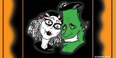
Artwork Mondays: Happy Hallowe'en!


Created for a Hallowe'en invite. Ink on paper, colours slapped on with the Photoshop paintbucket tool. I was going for an old Hollywood look.

I've cropped it a bit so I don't get the Citizens of the World Wide Web trying to cram into my apartment.


- -

All original artwork on The Flying Trilobite Copyright to Glendon Mellow. The contents of this blog are under a Creative Commons Licence. See sidebar for details.
Please visit my blog, gallery and reproduction store.
Wednesday, 15 October 2008

Face the muses

In my university days, science and art seemed to be considered non-overlapping pursuits. So I tilted at windmills and would show up at class with drawings of trilobites and extinct fish. The first time I showed up at class with drawings of trilobites, my prof said, "ooo, I don't want any of those in my soup," and the critique was done.

(note to self: cool idea - trilobites crawling out of soup and menacing a professor)

Science is a muse. But why? I need to explore my fascination. I need to explore so I can understand the weird little niche I'm in right now. There is also the more immediate and exciting reason that I will be attending ScienceOnline'09, and co-moderating a couple of sessions.

One session I will be co-moderating -with the inimitable Jessica Palmer of Bioephemera!- is entitled Art and Science - online and offline. I've posted a few notes at the conference wiki, and Jessica and I will be developing and refining the beats of the group discussion over the next while.

I view the world of art mainly through the eye of a painter. I'm fairly specific in my aims most of the time (Payne's Grey here, Quinacradone Orange here). I like using modern scientific ideas and discoveries as visual symbols for ideas like love and death and whimsy, as religious and mythological symbols once did in the Renaissance. So my thoughts about how science intersects art will be starting from a fairly specific place. How far can I expand my perceptions?

Learning from other bloggers helps. Renaissance Oaf continues his series But Is It Art? and has an astute analysis of the importance of the market, whatever the style of art. Bond's Blog pondered the variations in illustrations of one dinosaur genus, and how to move forward with his own rendition. My incomplete image of Haldane's Precambrian Puzzle wound up on Infectious Greed, an economic blog, illustrating the perils of lousy analysis. Cocktail Party Physics looked at the question But Is It Art? and showcased some fascinating examples.

It can be all too easy to get wrapped up in an image and not stop to ponder why it is exciting to me. It's time to face the muses.


- -

All original artwork on The Flying Trilobite Copyright to Glendon Mellow. The contents of this blog are under a Creative Commons Licence. See sidebar for details.
Please visit my blog, gallery and reproduction store.

Sunday, 12 October 2008

Artwork Mondays - CFI-Myers poster concept


After discussing with Justin Trottier and Katie Kish about doing a poster for PZ Myers' upcoming lecture here in Toronto, I knuckled down to think of some concepts.

PZ Myers is a big cephalopod in the atheist pond, and the C.F.I-sponsored lecture itself is scheduled for Hallowe'en. I played with some rough ideas of having PZ wearing a mask made out of zebrafish, perhaps with a halo of cephalopod arms behind his head.

PZ's personality and yes, celebrity is huge amongst science and atheist minded bloggers. It would be easy enough. I scribbled down some roughs.


But the focus of the lecture from its title is not a smug chuckle and a laugh at how
wrong creationists are when discussing biology (or history, or morals, or the universe, or transubstantiated baking). The focus is much more serious, it is about science education being under threat. Perhaps there is less of a young-Earth creationist view here in Ontario, and yet we are still under sway of separate Catholic and secular school systems. Some citizens would like more religious schools to be allowed by the provincial government.

I say no. One school system for all, with kids raised in multiple belief systems. It's how tolerance starts, it's how diversity and dialogue thrive. Besides, there's more room
for learning without being interrupted for prayers all day.

Canada is a cultural mosaic, and Toronto the capital of that ideal. Take the Dundas or College streetcar and pass through cultures from across the globe in 30 minutes. Besides, there's more room for learning without being interrupted for prayers all day.

So: PZ's poster. It needed to be serious and about the topic, not a poster about the foibles of this entertaining, important writer and scientist. Not a witty attempt at a portrait. Something about science under threat by religion. I hope there will be another day to show Myers the man through oil paint.

I started by thinking about that perennial symbol of school: the apple on a teacher's desk.

I had the sketch.

Then, painting it, not making the snake anything specific, but looking like it had coalesced out of a nightmare. A child's hand reaching up. A little double helix pattern on a tree branch.


We mucked around with the text. I wanted PZ's name and the title to be huge. It needs to catch the eye while posted on university and college bulletin boards and around town.

In my first presentation of this poster here on The Flying Trilobite, I wondered how people interpreted it. Artist-teacher Bond got it right. And Bora of A Blog Around the Clock had an interesting take in a recent email exchange: "
Michaelangelo's God from the ceiling of the Sistine Chapel and PZ's post on the evolution of segmentation in snakes!"

Does it do the C.F.I & PZ's topic justice? Is the religious/secular symbolism confusing? Are you craving a crisp macintosh right about now?
- -
All original artwork on The Flying Trilobite Copyright to Glendon Mellow. The contents of this blog are under a Creative Commons Licence. See sidebar for details. Please visit my blog, gallery and reproduction store.

Wednesday, 8 October 2008

PZ Myers is coming to Toronto - Poster

PZ Myers of Pharyngula is coming to Toronto to give a lecture about science and religion in education, and I've made a poster for the Centre for Inquiry Ontario.

See if you can figure out the symbols I used.

You can read more about the event and how to get a ticket, here. Or better yet if you live in the Toronto area, help support science and rational thought by becoming a friend of the Centre. Many of the events are free and they've got a staggering new library.

I'm looking forward to it. Like many people, after reading Richard Dawkins site for a while, I began to take notice of this PZ Myers fellow that kept cropping up.

I'm also looking forward to seeing this poster around U of T campus. I'll see if I can get any photos of it up, and I'll post them with the rough sketch and painting on the next Artwork Monday. As well, I'll explain the symbols - and let you know the explanations other people had for them!


- -

All original artwork on The Flying Trilobite Copyright to Glendon Mellow. The contents of this blog are under a Creative Commons Licence. See sidebar for details. Please visit my blog, gallery and reproduction store.

Monday, 6 October 2008

Artwork Mondays: Art is Easy

Art is easy.

Last week I lamented it is hard. And although finding the time for art is difficult, I am never at a loss for ideas. That said, collaboration often takes me places I never thought I'd go.

So on this Artwork Monday, I'd like to try a challenge:

For the first person to comment with a really unusual idea, I will try to come up with at least a sketch and post it by editing this post by midnight tonight. I'll check back on the comment section in about 12 hours (6pm eastern standard).

- - -

Edit: Okay, so maybe the previous Artwork Monday post was correct. Finding time for art is hard. I'm a few hours late, and the sketch is a little too simple and uninspired.

Rudi and Traumador's ideas deserve a little more time devoted to them, don't you think? I had some technical difficulties with another project I was working on last night, and well, it gobbled up my evening. Perhaps later in the week I'll post a couple of other pieces I've been working on behind the scenes for a while now.

- -

All original artwork on The Flying Trilobite Copyright to Glendon Mellow. The contents of this blog are under a Creative Commons Licence. See sidebar for details. Please visit my blog, gallery and reproduction store.

Thursday, 2 October 2008

The Big Debate

The Canadian English debate is in its second hour as I write this.

Elizabeth May is focused, intelligent and impressive. Her statements so far are backed up by facts, not appeals to emotion and cheap shot after cheap shot. I think May and Harper are the only two composed party leaders at the table. She has actually come with references instead of repeating the same soundbites over and over.

Get out and vote on October 14th. All the Canadian leaders are on Facebook; check their pages, read the platforms on their sites (here's the Green platform!). It's never been easier to be informed.

I'm voting Green. I've voted Green before, but never have I been more proud to. This woman is a leader.

- -
All original artwork on The Flying Trilobite Copyright to Glendon Mellow. The contents of this blog are under a Creative Commons Licence. See sidebar for details. Please visit my blog, gallery and reproduction store.
Copyright © 2007, 2008, 2009, 2010, 2011, 2012, 2013 Glendon Mellow. All rights reserved. See Creative Commons Licence above in the sidebar for details.
Share |